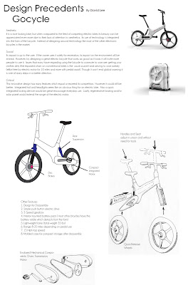
Wednesday, September 30, 2009

Dave Hood, Object Analysis


test of creating posts by emailing the blog

this is a test of a new method for posting to the blog. to do this, I went into "settings" and then "email and mobile", and then under posting options I clicked on "publish emails immediately".  It asked me for a "secret word", then used that to create a new email address that I will now (and in the future) use for this purpose. I sent the email to this new address (in my case "touchgraphicsInc.parsons@blogger.com"), and this message then appeared in the blog. I can also attached an image into my email, which also appears in the blog.

This is just another cool way to post to the blog. For example, you could use your mobile device to easily post things on the fly using this method. 
steven
I didn't get a chance to finish my presentation this morning, so I thought that I would post something that I was hoping to show you all. This is a video where Johnny Lee discusses his amazing discovery about how to acheive very low-cost head tracking with the Wii remote. Take a look I think you will like it.


The reason that I wanted to discuss this in relation to the topic of design research is that I wanted to emphasize that one purpose of doing research is to be inspired by the accomplishments of others. There is no direct relevance for Johnny Lee's work on the Wii Cane project, but it was important for me to see that others are hacking the Wii in creative ways, because it gave me confidence that I would also be able to produce a system that uses Wii in a way it was not intended for.  I also love what he does with the Wii because it is such a powerful idea, yet very economical and simple, really.

Tuesday, September 29, 2009

Leigh Ann Tucker: Product Values [updated!]


Thesis Precedent Products and Systems


Design Precedents_ Rhee Ju


The "Splinter" is two chairs mate neatly along a broken line of shifted wood slats to form a bench, or a bench that's broken and split in two.Two can sit close or seprate. The chairs are made from plantation grown teak and electro-polished stainless steel. They are suitable for outdoor and indoor use. I choose this bench because of its simple and it cause interaction to the users. I like the idea of "interaction" between the user and product, which means there is a product that emitting when it's used by the intention from the Designer. The product below is a humidifier and I saw this product at ICFF 2009. I thought this was really brilliant idea because the most existing humidifiers are requiring so many step of changing the water, and it should not be a tap water and cleaning the water container frequently, also it needs power(energy).
It may not work as well as the ones work with powers but i think its substantial in design, and a purpose of what it is for.


2 Products - Mona


Products Embody Design Values- Evanee Wu


Instead of choosing my products from specific designers or design firms, I started researching with three criteria: educational, form suggests function, and the most importantly, design concerned with living wellness.

The products I chose, Bento Triangle, Noodle Dispenser, and Eat Better Drink Better, are all food-related. Bento Triangle, resembles the food pyramid, aims to echo the healthy diet. Noodle dispenser, which limits the amount it dispenses, suggests users the appropriate diet portions. Eat better Drink Better was instead, designed to prevent the fast eating habits for dogs. Interestingly, all of their designers took similar approaches: form suggests function. Here the forms do not simply work aesthetically but also functionally.

The simple shapes are meaningful by acting as messengers to users. The intentions that designers wanted to to provide a better living can be seen through the products. Users are guided at a comfortable degree which shapes their behaviors gradually. The behaviors are actually, paths designers believe toward a better living.

The 2 Products _HS


Chika Design Precedents


Jar tops are designed by Jorne Van Ast. I am impressed by this product because of its simplicity. Sometimes I recycle a used jar to store homemade jam, lemonade or paint. Although I use the jar for storage, it always looks like a plain jar. When the user attaches tops to the lid, it transforms the jar into kitchenware and makes it more useful. By adding a spout or a shifter to the jar, it turns something into a practical tool.


I like this product because it makes me think outside of the box. There are many different types of CD players, but often they are placed on table, counter top, or ground. It is compact, perfect for a small home or office where space is hard to find. Placing the CD player on the wall also change the interior design of the space. It becomes a visual piece like a painting. The string at the bottom activates the player to spin perpendicular to ground. I also like the inspiration which came from old style ventilation fan.


The two products above based on their practicality. My third example are ceramic tea pots and cups. These products have a sentimental value for me. When I have meals with my family, I prepare tea before we start to eat. It is a ritual, and every person have their own cup. Because I drink tea everydays, I have attached to my cups like pet. I like tableware because they are close daily products. Also I think they are communication tools, connecting people.

Elias Kulukundis, Design Precedents


The Ulysse Nardin Chairman is a smart phone that contains both electronic and mechanical parts. My main reason for choosing it is it’s a great example of a melding of mechanical and electronic to optimize efficiency. The phone contains both an automatic watch movement and a manual winding crown. These two functions combined will greatly supplement the battery life and the phone being built to last as a watch is, gives it environmental efficiency without compromising. The exposed mechanical parts and screws give it an industrial, steampunk look to it.
Pharmajet has spent the past 12 years developing a jet injector that could be used the world over and cost the same or less that conventional syringes. The body is built with an intuitive design that anyone can see hoe to use simply from its look and feel. The injector uses a spring loaded air cylinder instead of gas cartridges and the single use syringe ends are recyclable and cheaper than needled syringes. The jet injector also provides a solution to people who have a phobia of needles. The Pharmajet needleless syringe has the potential to near eradicate needless hepatitis and aids contaminations.
Photobucket

JAKE SHAPIRO : 2 objects that rule.


Dieter Rams is one of the reasons I chose to study design. Everything about his products is perfect to me. It all just makes sense and it speaks to me the way I wish all products would. I just can't find anything wrong with his designs, especially his products for Braun. The braun products are so beautiful. The object looks the way it does because it has to, because thats the way to make it function. The efficiency of this radio is what makes it the most beautiful radio I've ever seen.


I feel similarly about this chair as I do the Rams radio. This chair is not only made of beautiful bent plywood. It is bent and constructed in a way of efficiency. The arms wrap around the back and hold it to the bottom of the seat. The point where the back meets the seat is just thick enough to support your weight. The four legs are bent from 2 pieces. The whole thing is held together with 6 screws. It's light weight and it elegant. When I sit in it I feel as though the wood is softer then it actually is and I can lean back in comfort. The arms are as comfortable as they are beautiful. This chair shouldn't work and it certainly shouldn't be comfortable. But it does. And it feels warm and it feels comfortable.

Sun Ki Jeon - Design Precedents


Monday, September 28, 2009

Design Precedents - David Lee


Aesthetic
It is a nice looking bike, but when compared to the field of competing electric bikes its beauty can be appreciated even more due to their lack of attention to aesthetics. Its use of technology is integrated into the form of the bicycle. Instead of designing around technology like most of the other electronic bicycles in the market.

Social
Its impact is up to the user. If the owner uses it solely for recreation, its impact on the environment will be minimal. However, by designing a great electric bicycle that works as good as it looks it will invite more people to use it. Issues that many have regarding using the bicycle to commute to work are: getting your clothes dirty (the exposed chain on conventional bikes is the usual source) and arriving to work sweaty (effort free by electric motor for 10 miles and more with pedal assist). Though it won’t end global warming it is one of many steps in a better direction.

Critical
This innovative design has many features which equal or exceed its competitors. However it could still be better. Integrated tail and headlights seem like an obvious thing for an electric bike. Also a quick integrated locking device would be great encourage everyday use. Lastly, regenerative braking and/or solar panel would extend the range of the electric motor.

Other Features
1. Design for Disassembly
2. Simple push button electric drive
3. 3 Speed gearbox
4. Interior mounted battery pack ( most other bicycles have the battery visible which detracts from the form)
5. Lightweight frame (total weight 35 lbs)
6. Range 8-20 miles depending on pedal use
7. 15 Mph top speed
8. Molded case for compact storage after
disassembly

OXO Vegetable Peeler


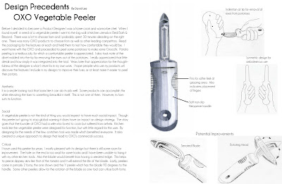
Before I decided to become a Product Designer I was a home cook and wanna-be chef. When I found myself in need of a vegetable peeler I went to the big wall of kitchen utensils in Bed Bath & Beyond. There was a lot to choose from and I probably spent 30 minutes deciding on the right one. There was many OXO products to choose from as well as other leading competitors. Read the packaging for the features of each and held them to test how comfortable they would be. I went home with the OXO and proceeded to peel some potatoes to make some Gnocchi. Potato peeling is a tedious job, for which a comfortable peeler is appreciated. I also took note of the divet molded into the tip for removing the eyes out of the potatoes. I really appreciated that little detail and how simply it was integrated into the tool. Years later that appreciation for the thoughtfulness of the designer is what I strive for in my own work. I hope people who use my products will discover the features I include in my designs to improve their lives, or at least make it easier to peel their potato.

Aesthetic
It is a simple looking tool that looks like it can do its job well. Some products can accomplish this while elevating the form to something beautiful in itself. This is not one of them. However, its form suits its function.

Social
A vegetable peeler is not the kind of thing you would expect to have much social impact. Though this peeler isn’t going to stop global warming it does have an impact on design strategy. The story goes that the founder of OXO had a wife who loved to cook but suffered from arthritis. Kitchen tools like the vegetable peeler were designed for function, but with little regard for the user. By designing for the needs of the few, a kitchen tool was made which benefited everyone. It also created a unique approach to design that lead to OXO’s commercial success.

Critical
I have used this peeler for years. I mostly pleased with its design but there is still some room for improvement. The hole on the end is too small for some hooks and I have been unable to hang it with my other kitchen tools. Also the blade would benefit from having a serrated edge. This helps to pierce slippery skins like that of the tomato and it will extend the life of the blade. Lastly, peelers come in primarily 2 forms, the one shown and the Y peeler which has the blade 90 degrees to the handle. Some other peelers allow for the rotation of the blade so one tool can utilize both forms.

Haewon_9.28_products


Monica Bhatia : Product interests and Design values

I think the theme that stands out the most and was in every one of my initial interest diagrams is playability. If all activities can be classified as either work or play I would say driving is work but rolling a tire on the floor to create a print is play. Taking a bath is work but lounging in the dutch tub is play. If work is an end result but play is a process then creating an interactive sculpture with the imagination playground is play while the finished sculpture is work. Toasting a piece of bread is work for the toaster, manufacturing the toaster is also work, but the way Thomas Thwaites melted and crafted his toaster in his kitchen was play.... play that involved alot of research.


I just think this is beautiful, and it isn't hurting anybody, imagine all the advertising that could happen here....


Theres something about this that is so appealing. Sure, kids play with a bunch of random stuff around the house and build things all the time, but I like that everything is made from the same blue foam, fits so nicely in the box and can be expanded as wide as the playground and can be played with by every kid in the playground too.


Always attracted to things that look a little gooey, or melty, or gross. Why is everyone trying to hide the gross? Its natural. Since Chelsea showed this to me a couple days ago I keep imagining everything in my house looking as if it were sculpted by hand.


Since I saw this at a local nursery I really can't stop thinking about it. I think I love how simple it is, the color, the shape, the feet. I would like to see a version where solar energy could be absorbed through the coils to heat the tub or a little crank could be attached to the side so that the bather could wind it up and release the stored energy to create a whirpool

JSHIN Assignment 9/28


Ga-Ram Han // Design Precedents

The Strida Folding Bike made its first appearance about thirty years ago, designed by Mark Sanders. In 2001, the Strida was redesigned and marketed towards a new generation of eco-conscious people who wanted to commute in a more environmentally friendly and healthier way. Out of the many folding bikes out in the market, I chose this particular bike because of its aesthetic qualities. From an initial glance, it is almost hard to make out what this product is. In that sense, this bike sets itself apart from any other folding bike. It bases its design from the most fundamental and structural shape out there; a triangle, thus creating a elegant and simplistic, yet very functional machine. Furthermore, it's compact folding size makes it convenient to store in tight spaces, tackling the issue of overcrowded apartments, and ultimately alleviating crowded sidewalks and streets. Keeping the bike indoors also gives the owner a piece of mind that their bike would not get stolen. 
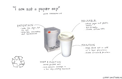
"I am not a paper cup" is more of a fun and conversational piece. It is constructed out of double layered porcelain , creating an insulation that keeps the beverage hot or colder for longer. Also, it's lid is constructed out of highly durable silicon, to ensure a tight seal around the rim to prevent spillage. All in all, this cup is a great example of form following function. It's made to do what a cup is suppose to do, and at the same time creating a commentary on waste of paper, styrofoam, and plastic cups through its alternative material choice. Curiosity will get the better of people, and then conversations will ensue, talks spreading about the idea of reusing eco-friendly products and raising awareness about post consumer waste.

samta shah


Design Precedents- Carl Frisk


James Krenov tirelessly worked as a woodworker nearly his entire life. In order to shape the wood the way he needed, he created his own tools. This hand-plane roughly displays his ideals as a designer. Smooth curves, only where necessary; a rounded end for the hand to cradle; and the perfect blade angle to shave wood. The reason this particular plane is so roughly cut is because he crafted it by touch. His knowledge and dedication to his craft permeated his life so much that even when his eyes failed him, he continued to work and create what he knew how to create. A lifetime of experience, accumulation of knowledge, and his ability to use that in order to create a plane that many people call perfect are all ideals that I seek to use in my career. I may not build planes, but what I do build, I hope to build with the same amount of passion and creativity as James Krenov.


Sam Maloof began as a graphic designer, but wanted a more rewarding career, so he taught himself how to build furniture. Through rough beginnings, nearly losing everything he had a few times, he came out one of the most revered woodworkers of the 20th century. Because he was self-taught he used some very dangerous techniques, such as freehand cutting on a bandsaw with the guard at it's highest point. But if he were taught how to properly use a bandsaw, he would not have been able to create the smooth, undulating curves in many of his designs. He proves that rules are meant to be broken, using dangerous techniques and solving problems without the interference of a master woodworker forcing techniques upon him. Aesthetically he uses wood in a way no other designer does, creating smooth transitions form piece to piece and rounding all joints. His ability to think outside the box and shape wood in a way that transforms it into something far more valuable than wood are elements that I strive to incorporate into my own designs in my own ways. But most impressive of all, Sam Maloof freely gave away every bit of knowledge he had. He did not believe in secrets, and believed that if all knowledge was shared, it would be for the betterment of the craft.

Andrea Kim: Assignment 3 - Design Precedents


I chose the AquaStar Plus because I value the lifestyle it addresses. This product was featured in the Design for the Other 90% Exhibit at the Cooper Hewitt.

For those who do not know what it is:

AquaStar is a product, designed to be sold to a high-end market to fund an application in the developing counties like Borneo, Malaysia, India, Mexico, Peru, Nicaragua, Guatemala, Australia, New Zealand. AquaStar Plus, is more expensive and used for very harsh environments (i.e. travelers, the military, and rescue workers.)

How it works:
Unsafe water is poured into the bottle and it is exposed to UV-C light which damages the DNA and RNA in microorganisms that can cause disease and makes them non-infective.

Overall, I value its consideration for the less fortunate, its use of technology, and its versatility for where it can be used. It is an interesting product that necessarily may not be “good looking,” but there is a bigger beauty in what it can do for people.


I chose the ipod/mp3/headphones not because it is a revolutionary product, in what it provides us when it comes to entertainment. I chose it because of the behaviors that surface from the use of it. From personal experience and from what I have seen on the train, people use their musical devices as a method of protection, a sense of space, and comfort. People use their ipods or whatnot as a way to deflect unwanted conversations and can turn an ordinary task into a different experience. The act of putting on your headphones can mean “you’re too loud,” “I’m bored,” “I can’t concentrate,” etc. But the act of taking them off can also send a strong message of your interest in a conversation. Products like this are revolutionary in how people behave and the psychology behind how and why they use it is extremely remarkable.