Monday, September 28, 2009
My hero <3
I am not unlike this very cool, enlightened man. This man is realistic, and practical- let's be less cute, and more pragmatic in our thinking. Someone please give him a cookie.


Vanessa Leung's Two Favorite Products
The First Product I chose is Konstantin Grcic's Miura Stool. The way I approached braking down this product was by analyzing every detail. I started with the colors, even though it is a solid bold color, it is balanced because of the thin couture of the stool. Furthermore, the form looks very hard and ridged, however when sat on, the angular cuts or bends are carefully designed that it is very comfortable. Another reason I love this chair was how it is not a traditional stool, it incorporates the proper use of technology and materials (injection molded solid polypropylene stool) to be able to create a very interesting form that still functions properly.
 The second piece I chose is Newton, a milk and sugar set designed by Tonfisk. I chose this piece, because at first it is very different from the product above. However, after analyzing this product I realized that they are very similar. The reason why I chose this product is because the concept and design work well together with a simple solution. The sugar floats on top of the milk, however it will not fall into the milk due of the indent on the top which holds the sugar bowl in place. The form of the spout is also designed a specific way to create a nice flow when the milk is poured. Similar to the Miura Stool above, I like how there are big solid colors that contrast one another, however still maintain a very balance and calm feel. Another similarity would be that the two products taken in the consideration of dimensions that are comfortable to the user.
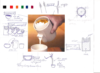
 The second piece I chose is Newton, a milk and sugar set designed by Tonfisk. I chose this piece, because at first it is very different from the product above. However, after analyzing this product I realized that they are very similar. The reason why I chose this product is because the concept and design work well together with a simple solution. The sugar floats on top of the milk, however it will not fall into the milk due of the indent on the top which holds the sugar bowl in place. The form of the spout is also designed a specific way to create a nice flow when the milk is poured. Similar to the Miura Stool above, I like how there are big solid colors that contrast one another, however still maintain a very balance and calm feel. Another similarity would be that the two products taken in the consideration of dimensions that are comfortable to the user.
KARENTINNEY:designprecedents
As I began to choose my design precedents, I found myself picking objects which reflected the future as well as the past. I chose many objects that were ingrained with a history - whether it be from historical inspiration, use of materials, or company integrity/tradition. However, many of these objects also have a sense of forward-thinking through their industrial processes or aesthetic.
Here is the resulting brainstorm of products:

I chose Hella Jongerius' "Repeat" for the way that it allows unique products to be created out of an industrial product. Its 12ft repeat ensures that no upholstered piece of furniture could turn out exactly the same. In reading about her process, I appreciate her inspiration from the textile factory, and the way that she made known this influence through the patterns she employs.


The second product I selected is Andrew Moe's Oslo Collection (demonstrated using the collection's dining chair). I chose this piece because of his usage of material; salvaged wood from old buildings. Though I do not necessarily agree with the aesthetic of the chair, I appreciate the creation of a contemporary piece made from materials rich with history - so that it is only through intimate details that the user is aware of the chair's origins.


patricia voto _ design values:

 Spaghetti Bench by Pablo Reinoso is a product or maybe sculpture that I have a strong appreciation for. Fine art has always been a hobby of mine, particularly abstract work, so when I see pieces designed to be sculptural or mindful of the arts- I'm instantly hooked. This bench is whimsical and thoughtful- it's creates a narrative by having these long and winding pieces of bent ply climbing up the walls. I couldn't help but imagine this in a park for people to sit on, admire, and be inspired by. Art is thought provoking, so when Reinoso combined a generic mass produced bench with these grand gestural planks creeping off the edge of the bench, one can't help be think about it. It's beautiful, organic, and random- three things I often try to incorporate into my design language.

I chose 2unfold by Hard Graft. It's a great product- both in function, manufacturing and in process. This bag considers the multitude of ways we attempt to carry a bag through our day and keeps in mind those heavy MacBooks we occasionally have to trek around with us. It can be carried over the shoulder, on the back, as a clutch, as a book strap, as a messenger bag, just in your hand and probably however you want to drape it across your body. At it's full dimensions the bag can carry a 17" macbook pro, it's able to fold in half to make the bag more compact and snugly carry a 13" macbook. They're designed in Austria and manufactured in Italy. 2unfold is constructed from vegetable tan leather made in small quantities. They are true hand-crafted leather bags with each detail meticulously inspected.
CHELSEA_BRIGANTI: COLGATE WISP: THOUGHTS?


I was handed this product sample while walking through union square last semester. I've kept it ever since as a reminder of why I've chosen this field. This product represents everything that is wrong with design: disposable[single use], uninformed and arrogant, both in terms of packaging and concept.


Formatting comments
Hello,
One big drawback of the Blogger service for creating and distributing blogs is that you cannot easily format comments to posts, nor is it easy to add pictures, videos or hyperlinks to comments. I am not sure why this is, it seems odd to me. Anyway, I am still working on this problem. In commenting on posts, I often want to point to some other webpage or insert an image. Apparently, if you know how to do basic HTML mark up, you can format comments. I found a helpful page where you can read about how to do that with simple HTML tags here.
steven
Sunday, September 27, 2009
Email of blog activity
Hi,

In the interest of ensuring that we are all fully aware of what's going on with thesis blog, I have created a feed of our blog activity that anyone can subscribe to. The feed, including all blog activity, is sent as a daily email to subscribers. I placed a widget on the blog right below the Parsons logo in the upper right corner. You have to enter your email address, and then you will receive a message in your email asking you to confirm that you want the daily feed. Right now, there's not too much action on the blog, but as the semester advances, there will be days when there are dozens of posts, so this email subscription makes it easy to keep up. While it is not a requirement that everybody signs up, I think you should, as it will help you to keep abreast of any and all activity.
steven
Friday, September 25, 2009
Parsons & NY Designs Present: Growing Your Design Business in Today's Economy
What
Join us for the first in a series on design businesses and entrepreneurship. Designers will discuss their experiences with starting and growing a business in the current economy. Speakers will explore how these challenging times can provide an opportunity for growth.
**FREE & OPEN TO THE PUBLIC**
TOPICS INCLUDE
· Promoting your design services in tough times
· Setting competitive prices that seal deals
· Building your client base & network effectively
· Managing cash flow issues
· Weighing the pros and cons of starting a business in today's economy
When
October 14th 6:30-8:30
Where
NY Designs
4550 30th Street, 7th Floor
Long Island City, Ny 11101
E,V,G and 7 subways stop at Courthouse Square; for complete directions go to http://www.nydesigns.org/directions.html
How
RSVP by Oct 5 RSVP@NYDESIGNS.ORG
Thursday, September 24, 2009
using thesis blog for posts of tangential interest....
I think that entirely new non-local cuisines could emerge from recipe wikis, and for me that's very exciting, because I am in favor of new-ness in general. But I can see how some people might find this threatening, because it could lead to reduction in the variety of ethnic cuisines and loss of traditional ways of doing things. So, while the recipe wiki story is not, strictly speaking, about product design, I find it interesting and worth thinking about because there might be ramifications for design in general, and how new technologies suggest radical changes in the way designers work. I would be interested to know what others think about this, and also about the whole question of inserting extra-curricular posts on the course blog. Please comment freely, and I will raise the question at next week's class. In general, I am very excited about the way the blog is shaping up, and so I am focused now on tweaking our policies and approaches to this excellent tool for sharing information and documenting our process.
steven
Tuesday, September 22, 2009
For Anyone Who Is Interested In Urban Housing:
http://www.japansociety.org/event_detail?eid=4aa504ed
Monday, September 21, 2009


Sunday, September 20, 2009
Decomposing a Thesis // headwest
Chelsea Briganti, Ga-Ram Han, Sun Ki Jeon, Sun Min Lee


What is this project all about? What is it trying to accomplish?
What relationships were forged to support the development of this product?
Relationships were established with Buffalo Re-use, Build it Green! Urbanglass, and Fabricators.
Revised Board:

Headwest by Silka Glanzman


What is this project all about? What is it trying to accomplish?
People of American Rust Belt have left the area, leaving vacant homes to deteriorate and crumble. As a result, the homes are being torn down. This project is trying to accomplish the preservation of American Rust Belt, taking and deconstruction of material for re-use, rather than demolition and waste.
What is the "product"?
Headwest is a product"system" that responds to the economic climate of the Rust Belt community with the goal being to increase population of the area by building new modern homes, with modern composite materials.
What research methods were employed in the process?
Research methods that were in the process are studied areas, photographic surveys, population densities, wages and demographics, market research and why did people left the area.
How did research inform the design outcome?
Use of traditional design language into new material gives the home a modern yet familiar feel to them keeping the vernacular of old material.
Use of traditional design language into new material gives the home a modern yet familiar feel to them keeping the vernacular of old material.
What relationships were forged to support the development of this product?
Relationships were established with Buffalo Re-use, Build it Green! Urbanglass, and Fabricators.
What is the feasibility of this project?
Socially - Relief tension of urban population, creating community and jobs.
Environmentally- Materials are up cycled, and re-purposed.
Materially- Keeping vernacular architecture in re-purposed tiles.
Economically- Revitalizing old factories, new population creates more job opportunities.
Functionally- Contractor standpoint. Tiles are made to specific specs.
Sample Boards for Retail Distribution:

Sample Boards for Retail Distribution:

Revised Board:


Decomposing Thesis : Bee Saver
Karen Tinney, Jerry Mejia, Lauren Rossi, Samta Shah

OVERVIEW: “Bee Saver” by Tae Lim is a project focused on CCD (Colony Collapse Disorder) which is the rapid death and disappearance of worker bees in a bee hive. She identifies the main source of this disappearance as the use of harmful pesticides that kill the bees directly and kill flowering plants whose nectar they rely upon. Her project aims to educate and involve the public about this problem and to inform them of the importance of bees to our ecosystem and to their consumerism.
Her product is a informational package for an alternative pesticide, orange oil, which is not harmful to bees. The packaging contains information to educate the consumer on these issues and encourages them to be involved through an online interface. The seed-impregnated packaging houses six small bees-wax bottles of orange oil, which when mixed with water create the pesticide. The product creates a sort of system for home gardening – in which the user is encouraged to plant flowers that are helpful to bees and to care for them in ways that are not harmful to the bees.
RESEARCH AND RELATIONSHIPS: Her research was primarily done through one expert, her Not For Profit, Pennsylvania State University Professor Diana Cox-Foster. Her market research is limited as far as a place for this product, where it should be sold, and who would buy it. User testing was comprised of other students, as well as her not for profit – giving her skewed results that were not necessarily useful to her design process.
She missed many areas of research that we have identified. These areas include speaking to the farmers about their choice of pesticide. If orange oil is so good why isn’t it already in use? She could have also spoken to a packaging design professional, because her project was so heavily based on the conveying information through packaging. Her lack of user testing made her project less believable. Her given scenario was not supported by real life trial of the system which her product presented.
Because of these holes her project seems to lack an understanding of the large scale of the issue that she presents. She chose to attack the problem from the consumer level rather than the producer level, and this choice was not justified through her research/process. Because she used the Professor as her sole source of information, it appeared as though she used the research as an add-on, and not as an integrated and organic part of the process. This research was not revisited, questioned or synthesized during her design process.
DESIGN DEVELOPMENT AND MATERIALS: Her project began as a study on packaging and stayed there throughout its development, rather than allowing her research discoveries to change her end result. Her process was therefore concerned mainly with the formal aspects of the object and with the graphic elements.
It did not appear as though a lot of research was done on the materials used. She employed a variety of materials and an extensive amount of packaging. Paper impregnated with seeds, bees-wax, and orange oil were all employed in a sort of package within a package – leading us to believe there could have been an more efficient use of materials. She begins to make a system of materials that are centered around the care of plants, but breaks it with the bees-wax container, whose proposed purpose after holding the orange oil is for “personal use.” We see this as an opportunity not full explored and a waste of resource that was seemingly only added for its bee-related origins.
FEASIBILITY: SOCIALLY: It is hard to imagine this project to be socially feasible because of her lack of user testing. It also asks a lot from the consumer and a certain investment of time. We wonder if there is a market for this product and if so, where? ENVIRONMENTAL: This project is not on a large enough scale to make a real impact on “saving the bees.” Though it is quite poetic in communicating her idea and educating the consumer, we think needs to appeal to a wider market to have impact. MATERIALITY: There is a waste of wax, in which she employs an item produced by the bees and then it is presumably thrown out by the user. What is the point of employing this material and then wasting it and how does that speak towards the ultimate goal of saving the bees? The product could use less material – the idea of little packages inside of a bigger package is confusing and not necessary. ECONOMICALLY: Sold for $20 – expensive for a do it yourself kit. How many people can afford this system and of those who can, how many would actually want to buy it? FUNCTIONALITY: Too much information presented, too many assumptions on consumer action, too much material to deal with.
PROJECT REVISIONS:
RESEARCH: We first did some experiments with making the orange oil to see how it reacted with water - whether it would separate or be absorbed into it. We also did some market research of other pesticides in order to see why orange oil was so much better. Through this research we also gained an understanding of packaging of existing pesticides.


RE-DESIGN: We decided to stick with her idea of using Orange Oil pesticide and set our focus on the package. How could this package appear more like a pesticide and less like a do it yourself kit? Through sketches and models we worked on modernizing the typical spray bottle to make it appear different at first glance to the consumer, and to invite them to engage with the information it displays.


Subscribe to:
Posts (Atom)